
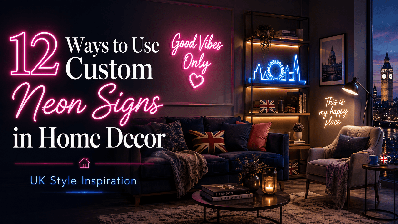
The word “neon” still conjures up images of pink cocktail signs and student flat walls — but that’s not where the category is anymore. Used well, a custom neon sign can look genuinely considered in a modern home, not novelty. The difference comes down to placement, colour choice, and restraint. Here are 12 ways interior-focused homeowners are actually using them in 2026.
1. A single word above a bed, not a full phrase. One word in a soft warm-white tone reads as intentional. A full sentence starts to look like merchandise.
2. Kitchen island pendant alternative. A slim horizontal script piece mounted above an island, dimmed low, adds warmth without competing with task lighting.
3. Nursery night light replacement. A small shape (a cloud, a star, an initial) on a dimmer doubles as a genuinely useful low-glow night light.
4. Home office “on air” style signage. For anyone doing video calls regularly, a subtle sign in frame adds personality without being distracting on camera.
5. Staircase landing feature. An awkward blank wall on a landing is one of the best under-used spots for a vertical script piece.
6. Home bar or drinks trolley area. This is the classic use case, and it still works — just keep it to one colour rather than multi-colour for a more grown-up look.
7. Walk-in wardrobe or dressing area. A small motif (a name, a symbol) above a mirror gives dressing areas a boutique feel.
8. Garden room or summer house. Weather-rated LED neon can be used outdoors under cover, and it transforms a garden office into somewhere you actually want to sit in the evening.
9. Gallery wall centrepiece. Instead of framed prints only, a neon shape mounted at the centre of a gallery wall breaks up flat frames with texture and light.
10. Above a fireplace, off-season. In summer months when the fireplace isn’t lit, a horizontal neon piece above the mantel keeps the focal point active.
11. Wedding or event decor that becomes home decor after. Couples increasingly commission a custom neon signs with their names or wedding date for the reception, then take it home and reuse it as permanent decor — better return than a one-use prop.
12. Kids’ room name signs. A simple first-name script in a soft colour is one of the most popular starter pieces, largely because it can be swapped out as the child grows without a full redecoration.
The One Rule That Makes All of These Work
Across every example above, the same principle applies: one focal piece per room, not multiple. Neon reads as a statement light, not ambient lighting, so treating it the way you’d treat a single piece of art — rather than scattering several signs through a space — is what keeps it from tipping into novelty territory.
Getting the Colour Temperature Right
This is the detail most first-time buyers miss. “White” neon isn’t one colour — it ranges from a cool blue-white to a warm amber-white, and the wrong choice can clash badly with existing lighting. If your home leans warm (wood tones, warm bulbs elsewhere), match with warm white or soft pink. If it’s a more minimal, cool-toned space, ice blue or cool white will sit better.
Suppliers that let you see a physical sample before ordering make this far easier to get right the first time. NeonChamp offers a free design proof on every custom neon sign order, which is worth using specifically to check the colour against your actual wall and lighting, not just a screen render.
Bottom Line
A custom neon sign works in a home when it’s treated as a lighting decision, not just a decor accessory — get the placement and colour temperature right, keep it to one statement piece per room, and it stops looking like a bar and starts looking like considered design.